* In what ways does your media product use, develop or challenge forms and conventions of real media products? *
*How
effective is the combination of your main product and ancillary texts?*
*What have
you learned from your audience feedback?*
*How did
you use media technologies in the construction and research, planning and
evaluation stages?*
Below I have answered these questions using some different forms of digital media on my blog, they are in reverse order so they can be read through from 1-4
Final song choice from the indie/alternative genre:
CAMERA SHOTS- Existing products/my product evidence I am in fact following conventions throughout my music video.
I have found some shots in my music video, that are similar to the shots featured in existing 'abstract' music videos that also feature some miming scenes from the actors
GRIMES-VANESSA
This is a medium close up shot, of both the main female actresses in the music video (main female artists) who are singing the songs. In both shots they are able to show emotion to the audience, which is a convention of doing a medium close up shot. In both screenshots you can see that they're not on plain white backgrounds and theres other things going on, but both still are the main focus of attention. It's so the shot doesn't get too boring but you still see the artist in the music video.
GEORGE EZRA - LISTEN TO A MAN
This is another music video were the artist is singing in a medium close up shot, in a similar way to George Ezra in his music video, this is showing it is a conventional camera shot, were the singer is looking at the audience. I did decide to include a performance element in my video which follows convention, because I do think it is an important part for the fans to be able to see the artist they like singing the song.
RAE MORRIS - COLD (FT FRYARS)
Here is an example of a music video about a couple, which is an abstract style. Again the main male singer is singing to the audience in a medium close up shot, you can just see his shoulders and he is the centre of the screen. He is dressed quite plain, as is Jack. The singers themselves are not making a huge statement, so are following the conventions of dressing to suit the video/song.
This music video is similar to mine, because it is abstract and features a couple to are both miming to the camera in the video, along side other things that are going on in the video that are not that related to them miming, but the element of performance has been included.
GRIMES-VANESSA
Here is another shot similar to my own, taken from a real media product. It shows I have fitted in with the style that is seen in the indie/alternative genre music videos. I found a few examples were dancing was quite important to the video and quite modern in style - so I wanted to include this in my video. This style of dancing is just the artist going for it, for my music video I did break from the convention by not having it in black and white - I did in fact include some effects on the clip to represent the feeling that colour is showing emotions throughout my whole video!
This music video my OPALE is something I saw and was really taken back by the way the music video used different lighting effects without editing them on after- so my music video is developing the genre by using projection which is a technique that is actually becoming noticeable in the pop genre! Taylor swift has a new music video called 'Style' in which projection is used to show the couples feelings
Overall in my music video I think I have followed conventions appropriate for my genre -
Shot length (short and snappy, when it comes to editing to the pace)
costume (this is not too busy, but in fitting with the feel of the video and also is the style which I planned originally in the planning and research stages of my advanced portfolio)
use of high angle + over the shoulder shots - these are what I have seen in other existing products which proves that they are a conventional feature. When my couple are performing against the wall.
Challenge conventions by
Use a lot of abstract shots
not a lot of acting / lip syncing (although it does feature)
MAGAZINE ADVERT- what conventions have I followed/challenged
The conventions are followed by me for my magazine advert, as you can see when you look at it and existing products.
The LARGE name of the artists - this is a convention that is followed because the target audience need to know who the advert is about or theres no point in making one! It would cost to have the advert in a magazine, so its vital to make the most out of the space and not make the advert too busy. All the important information to the customer is in large and noticeable font.
The Release date
It features photos of the artists
the large title
release date
photos of the artists on the front cover
not too busy with alot of writing
THESE ARE CONVENTIONS ALSO SEEN IN THESE EXISTING PRODUCTS
*ALBUM*
The album I have created does follow conventions, my album includes
The track list featured on the album
The name of the artist 'Deux'
The name of the album its self 'Soft Notes'
The barcode
Bandwebsite
The record label
Some information on the back of the CD about copyright
I have also taken inspiration from my music video! Which is creating an overall style for all of my products. The bold colours really tie it all together, I feel.
The colours are really important in my video, because I want the colours been projected onto my artists to represent different emotions that are in your head, especially because they are a couple in the video the feelings are amplified with each other. They asking each other to come home and you see them singing this whilst the colours are all going on the screen, its what they are thinking and trying to ask each other. Its like what is going on in there head, the bright pinks and reds to represent the love that they feel for each other, the pale blues are too show the sadness that they are apart from each other, because over all the song is wanting somebody to travel to be able to see them and if they are willing to. 'If you wanna try, you could come out and see me'. Using the images to try and convey a meaning to the audience is quite a postmodern take on presenting my music video to the audience. I am trying to represent one thing to them - but everyone might not get the idea and make sense of it differently to someone else watching the music video. But I like the idea that people are going to be watching the video and making up their own mind and ideas about it. One thing might really click with one viewer and not with someone else watching it - however I think it is still a video that is pleasant to watch even if you don't go too far into the meaning if you don't want too.
*GENRE*
My video is using both non stereotypical and stereotypical aspects of the genre Indie/Rock. It does this through use of mise-en-scene, camera angles and shots length. I think it develops the genre by showing of the own unique style used in indie/alternative. The genre that is a mix that music that has a strong identity but can't always be labelled with one name - leaving it quite open to interpretation. David Buckingham’s theory of genre helps me to explain my point - He said “Genre is not… Simply ‘given’ by the culture: rather, it is in a constant state of negotiation and change.” As genres change over time, we end up with many sub genres or hybrid genres and this means that the two genres are working together to create a new style. I think indie/alternative is a good example of constant change as people having access to better technology they are able to create their own tracks and music videos - this has lead to indie/alternative slowly becoming more at the forefront of the music industry, and my choice to use a song from the genre is reflective of the constant change and expansion of genre David Buckingham can see.
Overall I really think I have created a style which continues over all my products - I took direct inspiration from my music video to decide how i wanted my ancillary texts to look. There is clear connections between the products that you can see.
*FONTS*
I wanted the main fonts on my ancillary texts to be cohesive with my product so chose a font style from 'dafont.com' and used it throughout on both my ancillary texts.
The same font is used for the mast head magazine advert and therefore reinforces ideology of my artist. I also used the font on my digipak, this allowed me to use a 'house style' of fonts and I feel it compliments nicely to the overall look of my texts and how they work together. I think that these fonts i chose reflected the indie/alternative genre because they are not overly busy and in a black colour. This is seen throughout my products to keep them all looking similar, whilst also showing subtle changes. As they don't all want to be exactly the same otherwise it would be boring.
The same style throughout all products creates the start of a brand for my artist. This is a very common feature of artsits these days, they are no longer just singers or performers - but branch out creating an iconic style that can be transferred onto different merchandise (T-shirts,posters and so on)
*COLOUR SCHEME*
The colours I have used projected onto my actors in the music video also feature in on my magazine advert to create the continuity between the products and create an over all style. The colours are really bold and bright,but I have used a plain white background in consideration of the bright colours, I didn't want to over do it. My CD case is conventional because its following the same colour scheme, although I have chosen to do the blue as the main colour, instead of a white background to make it more eye catching to people who would be buying the CD. It was also important to me to include album art on it, because thats a convention of the indie/alternative. With bands like Cage the Elephant who don't have pictures of them selves on the albums, but drawings or pictures that suit there theme. The album art of a CD can be really iconic as well sometimes and makes the albums more memorable and different to each other - compared to other genres like pop were the album covers are usually quite similar and feature the pop artist with make up on and their hair done, to look nice for the fans.
The colours are really important in my video, because I want the colours been projected onto my artists to represent different emotions that are in your head, especially because they are a couple in the video the feelings are amplified with each other. They asking each other to come home and you see them singing this whilst the colours are all going on the screen, its what they are thinking and trying to ask each other. Its like what is going on in there head, the bright pinks and reds to represent the love that they feel for each other, the pale blues are too show the sadness that they are apart from each other, because over all the song is wanting somebody to travel to be able to see them and if they are willing to. 'If you wanna try, you could come out and see me'
HOW does my media product relate to media theory I have learnt throughout my advanced portfolio?(the different areas)
*Representation*
I believe my product does not accept Laura Mulvey's 'Male Gaze'theory. My video is of the indie gnere, and this isn't one that is conventionally one that is very sexualised. Existing products show that abstract and performance are popular and woman are not the main focus of the video. My video is not meant to appeal to people because of the sexualisation of one of the main artists (Kate) but they are both equal and just expressing their feelings throughout the video, I think an achievment of the video along side my ancillary texts is that both the male and the female are seen as equal throughout (no high angles on the women - no low angle shots on the men) but just medium close ups throughout the perfomances, with equal parts throughout the video .Although i do agree that Laura mulvey's male gaze theory may be relative to certain genres, i don't think it applies overly to the indie and alternative genre. If I was to sexualise and objectify women in my video, I dont think it would fit with the romantic and 'real love' theme I was going for. For example my video doesn't include and women's bodies, bottoms and so on so it doesnt follow her ideas. I tried to represent modern attitudes towards genders by creating an equalibrilum between the two main artisits. They are both trying to express themselves and by the end they do come together, by both expressing how they feel. I think this is also represented in my album case, because there is no artist photo on this ancillary text - I am not using a female to encourage a male gaze as a way of getting popularity. I am following a convention of the indie/alternative genre by using album art.
Richard Dyer states about the 'Star theory' - "stars represent and embody certain ideologies" I think my artists do represent the indie/alternative genre. They do follow their own way, by having a non conventional 'house theme' colour style, using 4 main colours instead of 3. But the products all combine to show off what the record label requires of them- in the end to record label Rough Trade, will want the artists to be successful and make money for them, do this they need to create an overall look that is going to appeal to the audience. By following conventions I have represented the indie genre in a way that I think is quite realistic to other artists in the genre - such as Grimes.
*NARRATIVE*
Tim O'Sullivanargues that all media texts tell us some kind of story. My video incorporates abstract with a performance element, but i think it does show an over all story of love between the couple - at the start it is trying to show that they want to see each other and are asking the other person to come and see them - developing to the end were they eventually do get to see each other and go off into the distance at the end. It is showing a successful love story. O'Sullivan also stated that narrative theory sets out to show that what we experience when we 'read' a story is to understand a particular set of constructions or conventions. With the conventions that I have followed including the close up miming to show emotion, over the shoulder shots, when the couple are singing to each other and different colouring effects it allows for the viewer of my video to makes sense of what they are watching and what my music video is about - viewers might make sense of the video and relate to the way it doesn't follow a perfect narrative, because real life never does!
So I decided to set up an initial survey when I had my near to finished music video,I thought that at this stage if I could improve anything it would be a good chance instead of leaving it too late to make the changes I wanted too. I did it through survey monkey and sent the link to people via social media. This is the music video my first survey is about:
FIRST VIDEO FOR FEEDBACK
These are all the questions I asked the people who took my survey, I decided to include some questions with a set choice of answers to choose from to get some quantitive date, which can be put into a graph etc to compare - but I also included some open-ended questions that meant people could answer in as much detail as they wanted to gather some qualitative data which is more in depth and you get peoples opinions, which is valuable when finding out what I need to improve. The survey I sent out was also anonymous and I felt like this was important because people can answer honestly without thinking they are going to upset or offend me! I wanted some honest feedback instead of just getting my friends to say things to be nice.
My target audience is not really under 15, but I think its important to have that option because the target audience is not always the people who are seeing it every time, for example on music channels on the television, anyone can watch the music videos.
I asked this because I wanted to create continuity between my products and create an overall style, which is what real media products do.
I had origionally plannned a music video thinking it was narrative, but on reflection and looking at my story board I would class it as abstract with some elements of performance. I wanted to see if this came across to the audience.
Really important question, because I wanted to find out what was wrong with my video and it takes alot of time and effort making the video so I wanted it to be right!
If the audience didn't want to watch it again, then it's an indicator that they didn't enjoy it so it needs be improved.
I wanted my actors to look like they had real chemistry and not be too awkward on screen, so it was more believable. And because I know them its harder to tell if they look natural or not, because I am around them in day to day life.
MY VIDEO IS A GOOD EXAMPLE OF A VIDEO THAT HAS A MIX OF ELEMENTS, ABSTRACT BUT IT DOES REACH AND ENDING WHICH IS COMMON OF A NARRATIVE, WITH ASPECTS OF LIVE PERFORMANCE. MY TARGET AUDIENCE ENJOY THIS UNCONVENTIONAL MIX TO CREATE A COLOURFUL MUSIC VIDEO THAT FITS WITH THE PACE OF SONG.
What did I learn about my first draft music video?
So I learnt:
My viewers wanted me to fill in the blank spaces, because any black on the screen for a long amount of time really doesn't look good for the video and you can really notice them, especially when you watch the music video for the first time, like I had begun to get used to the blank spaces because I was used to editing the video and seeing them.
Another thing i discovered from my feedback is that my audience preferred the natural colours of the shots that are not off my actors miming. In my first draft my video has a filter on certain shots called 'Steel' on final cut pro. I originally did this to show the difference between the colours being projected on my actors (this is meant to be inside their minds and all the colours showing different emotions clashing!) But after feedback and reflection I noticed that they were different enough types of shots to each other, without adding a filter onto it which made it look a bit tacky
PLEASE WATCH THIS PREZI TO SEE WHAT I LEARNT/PLAN OF ACTION !
I completed a survey asking if my products worked well together, below is the response I got - it impacted on how my ancillary texts were put together!
In conclusion Stuart Hall's reception theorystates that media texts are encoded by the producer. I am the producer of my own music video for my advanced portfolio which which would explain that there is meaning in the video and it is representing values and messages. The text is then decoded by spectators - in which was carried out by getting audience feedback from my target audience. Spectators are always going to decode the text in different ways and not necessarily regardless. However in my feedback research I think it does show that my audience get the overall idea and feel of my music video.
(: SUCCESS!! :)
My audience feedback shows me that the target audience ARE interested in watching my music video again, I was a bit scared to show people my products at first because I really wanted to do well and if I had put all the work in and it turned out rubbish I would have been very disappointed. The fact that my target audience would watch it again, and not only if they were asked too makes me feel i have created a product which appeals and is liked by the audience as well as being understood.
At the start of the college year I decided I wanted to be able to have access to a computer at home, instead of only having access to the computers and edit suits at college. I got another job to save up the money to buy my own laptop and this really increased the range of technology I could use to create a variety, for my planning and research and also my products. In 2015 I had saved enough money to buy a laptop and i decided to go for a Mac Book Air, so it will last a lot of time and throughout uni when I go. The things I could access because of using my mac where:
Messages (this was useful for linking my laptop and my phone together, when messaging my actors about arranging things. It meant I could get iMessage and my texts whilst using my laptop!)
Calendar (perfect for planning different schedules for filming, it meant I could put reminders on deadlines and then keep up to date with them)
iTunes (iTunes is where I got access to the song im using in the video for my project, I already had the album, but if I didn't I could have bought any new songs I needed. Itunes linked to the software I created my music video on.
iPhoto (I uploaded images onto my laptop from cameras and the SD cards I used to save pictures on
Final Cut Pro (This is a major contributor to how I made my final product. My friend Alice helped me to upload the software onto my laptop so I could create a music video using professional software, that worked well with my brand of computer)
iMovie ( I practised some ways of editing to the beat on this, before I got access to Final Cut Pro and as i'd not edited videos before, it was quiet useful to get a feel of what to do)
Here are some pictures of my laptop and the icons of a couple of the technologies I used!
iPhoto
Powerpoint
Photoshop!
There are some other technologies that I have used that are not specific to my laptop:
Microsoft
Office - Word and Powerpoint (I created different posts on powerpoints and saved the slides as a J.peg
Photoshop - C6 - My ancillary texts were made on photoshop, I downloaded a trail and use it without the internet, so that I can use photoshop at home because I couldn't afford to buy the software. Luckily I had access to it in college, so could make progress at home then bring my products in on my memory stick and do work at college.
Below I have gone through the media technologies I have used, I have decided to talk about each area individually. The types of media technology I have split these into include the hardware I used such as my macbook, sd cards,headphones,iphone, the college camera and tripod and also the chargers for these. My next set of videos are on the web-based media technology I have used which include the websites I found really useful throughout the stages of my blog, these include 'Skrib' ,google, mindmapup.com , dafont and many more. Next my vidoes show the software media technologies, these are all the programs that are downloaded onto the computer I have used and include powerpoint and word, final cut pro, photoshop and iMessage. I have done a separate section of video for the social media used because it has impacted in it's own way on the work I have done on my blog + they are all websites/social media sites that I can take around with me on my mobile phone :
*MY VIDEOS EXPLAINING WHAT I HAVE USED*
Hardware Videos:
video 1(mac book air, bluetooth wireless speaker, hard drive, memory stick, phone cable and headphones)
Web-Based media technologies:
video 1 (Google,Skribd,mindmapup.com,Dafont,Spotify)
I have ordered a new USB3.0 Lead for my hardrive which will hopefully resolve the issue of having missing footage, in this version of my video I have edited to the beat. There is a dark colouring on the narrative style part of the music video, I decided to do this so the viewer can differentiate between the abstract projecting onto the faces, where the actors are performing the lyrics ( this is meant to be all the emotions going on in their head and how they are really feeling) - asking the other person to come and see them.
These are the images all one one page prior to editing to them.
*FONT IDEAS FOR AD*
(fine shadows font)
As you can see I have created the initial magazine ad, Im actually really please how its going so far, i have used the same colours as my music video to create the similarites between music video and ancillary text. My add features the logo for Domino records which is an indie record label, so it suits my genre.
Still do to :
Experiment with a coloured black group, perhaps use a black background with white writing. To create a bold ad.
Include more places the album is available to be bought
I want to make the release date more eye catching
I am adding some edited photos which are quite faded into the background of the ad, so that there is some original images that I have taken myself. On the screenshot above the blue shapes represent the photos ill add. A profile shot each and a close up front on shot.
To be able to achieve the look I wanted for my magazine ad, I experimented with Photoshop to try and make it work, but was struggling. So I looked up on the internet to be able to try and find a soloution. Luckily I found a step by step guide, at
http://www.photoshopessentials.com/photo-effects/blend-photos/. I am in the process of blending the two photos of each person together (a profile shot and front facing shot of their faces)
The idea of this is showing the two sides to people, in my music video there is meant to be two distinctions between what the people are singing and also the actions they are taking. When the colours are projected on their face, this represents all the different emotions and feelings people have. Then you get to see the actions they are taking to get to each other.
The first stage to creating the the CD case I wanted to, was to pick my first colour scheme. I wanted to have a go at creating a few, to see what works well and what looks the best. I found a 6 panel Digipak template by logging on to my colleges old system and going into the media section that was made for the students. It gave me a link to
This is an online websites that lets you download and use their templates for creating Digipaks. I decided to use a template because all the measurements are accurate and ready to use - to be able to design a CD case to the right dimensions. If I had created a template from scratch, it leaves less time that I can spend on developing and experimenting with different design ideas.
I selected the 6 panel Digipak template as an adobe file
Then I opened it using Photoshop
then i saved the file as a Jpeg, that I could then reopen as a layer in Photoshop to be able to edit and create a professional looking Digipak
1st COLOUR SCHEME: Blues,Dark Grey & Off White
This is the first development of my ancillary text. I am using Photoshop C5 to create the CD case. The way I have decided to do it is enter a template onto the Photoshop document and then use my own images.
I have included some interesting art work on the album, without yet adding any silhouettes or pictures of people on the album. When I was looking at existing products there is a huge popularity for original art work, that can be iconic to that album. I have included a picture of some artwork that I took whilst I was at Berlin Film Festival. I took some close up shots of street art with the intention of using them on my CD case. I think original art work suits the genre more, as indie artists class themselves as more creative and original then the pop artists that churn out similar music to each other as quickly as possible. That is the meaning behind using a art work focused CD.
Adding the first silhouette to my digipak, I had to find a take a picture from the side and then draw over the outline on Photoshop. It was time consuming but wanted a image that fitted what I imagined the best.
Here are some of the Genre CD's that feature lots of album art work;
http://www.loonapix.com/ Is a website that enables me to edit my ancillary texts into settings in the real world. Im going to use it to add my promo poster onto different things to show how it would actually look. Im also planning on printing out a version of my CD cover which means I can fold it and stick it together to create a mock-up to show a real version and not just leave it to the imagination, when looking at the digital version.
I was struggling for a long time to imagine a name for my act up. The original band my song is from is all male, which made it harder to imagine a name just from the song I was using, which features a singer on it that is female. I decided because the theme of my music video is love and France is a meant to be a romantic place with the stereotype of being the place couples go - I went for the name Doux. This simply means 'Two' in French. The song is just about the two people in the song and featuring in the video and this is what the act could be about overall. Whether people take is as the two meaning the two individuals in the band, or the way they two people in a romantic couple, two is simple enough to let people interpret it how they want
~ FONT IDEAS~
1.
2.
3.
4.
The phone labelled 1, really appealed to me because incorporates the symmetrical style of a mandala into the font which would allow me to use the rest of the space on the ancillary text to fill with things such as reviews and ratings which makes it more believable
Here I am messing around with editing to the beat of the introduction instrumental of Home By Now. I did find this difficult at first, but because I'm using this technique in my final video I want to be able to practice as much as possible.
My ancillary text will be a digipak that uses illustration and also photographs I have taken, with the idea of manipulating them on photo shop to work as best as they can. Firstly I am creating a CD cover/pack which is made up of 6 pieces that when printed and folded work to create a album for my artist + the music video.
The first colour scheme i want to use is a violet blue, very dark grey (nearly black) and an off white colour. The colour blue is taken from the inspiration of an image I took whilst in Berlin. The other colours compliment this. The image makes a really strong front cover that could be used as album art - which fits with a convention of what other artists do in the same genre. The second colour theme I have is inpiration taken from this image that I have taken myself:
The vibrancy of the colours fits with the young band members featured in the video and their youthfulness. There is also a running theme of bikes. My characters are using bikes to ride out to see each other, because this is what the male vocalist is asking the woman to do. Using a bike in big cities has become much more popular in recent years and the sales of 'fashionable' bikes has increased. My theme is reflecting the way society is increasing the interest in bikes, and sees them as something to spend more money on and take care of.
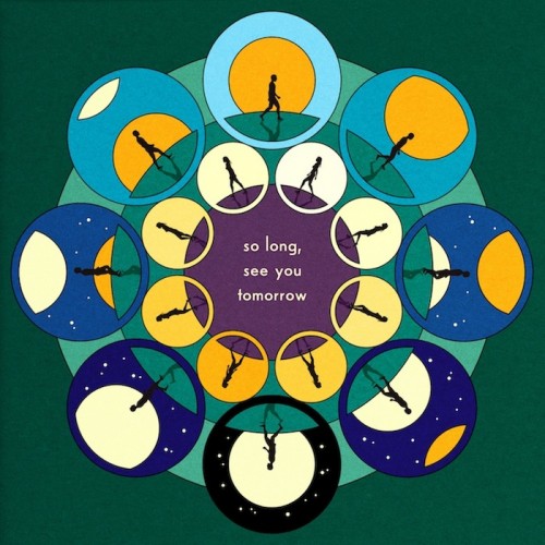
I have discovered Mandalas are really popular designs with people who are into 'indie' music. The band which I have chosen my song from is classed as indie and have fans who have followed them from the beggining, to becoming more popular aswell as new fans.
Featuring a mandala on my digi- pack would be really infitting with the theme of my song. I think if its something the target audience is interested in too, the artwork will be really important too them. It can add something intricate and interesting onto my product, without going over the top with cramming to much on or including too many colours. Which could be off putting for a genre which normally has quite simplistic designs, or features original art work.
~EXISTING PRODUCTS THAT INSPIRE ~
The features of this ancillary text, fit with what I image my ancillary promo poster for the 'Deux' Album will look like. I really like the language used on the poster, its all really positive but also gives the reader all the information they need such as release date.
The imagery on the poster is relevant to the release, because its no only an album but a film that is being released by the band. The way you can see the lead singer looking down into a video recorder is relevant and makes you think that's what the filming was like, them actually filming their journey. This is appealing to fans who want to know more about the band and what they're like beyond the performances they have seen and music videos they have made.


